Growth-Driven Design
Brand Identity
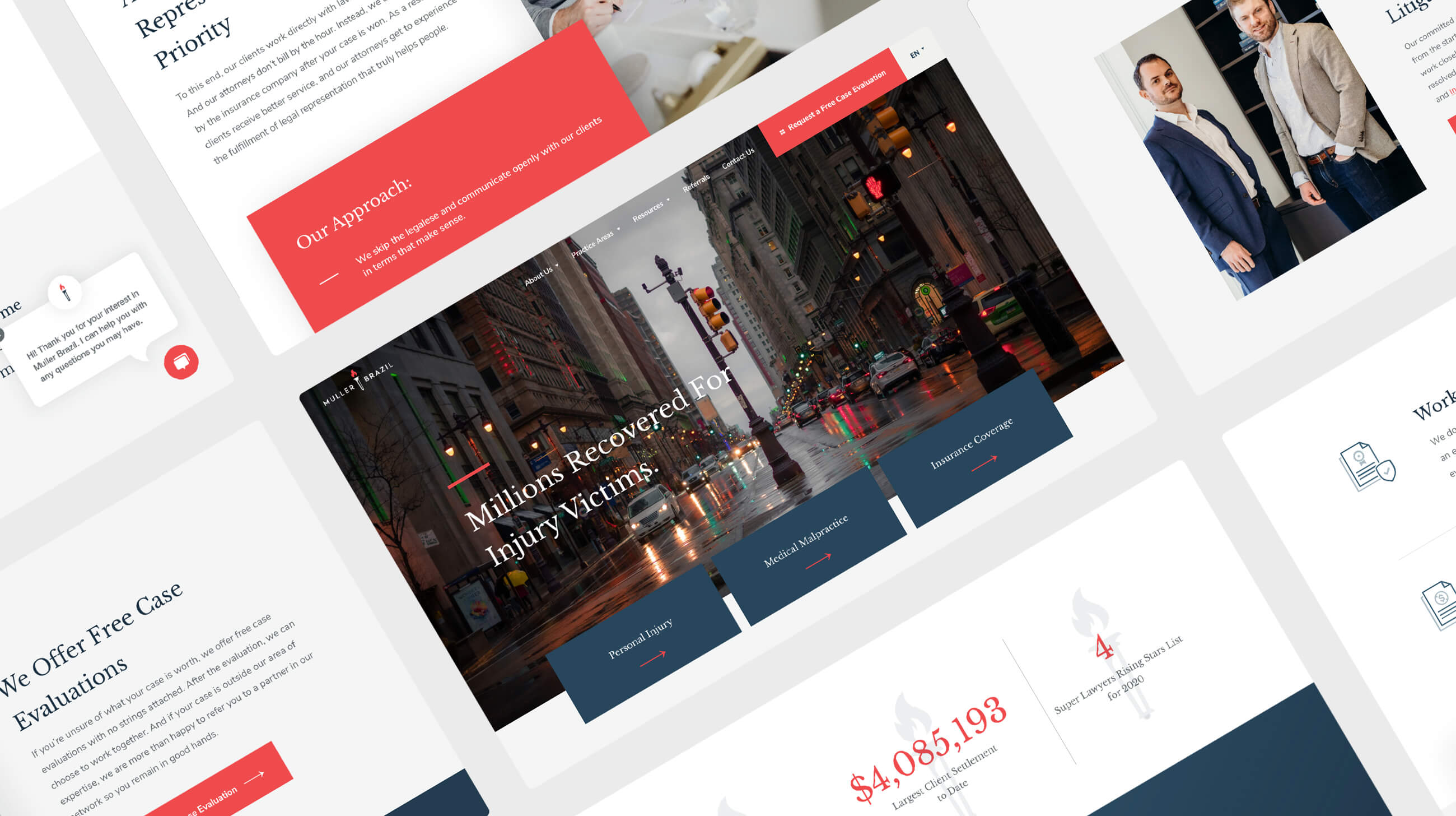
As a personal injury firm on a mission to champion its clients, it was important for Muller Brazil’s new brand identity to communicate this unwavering commitment.
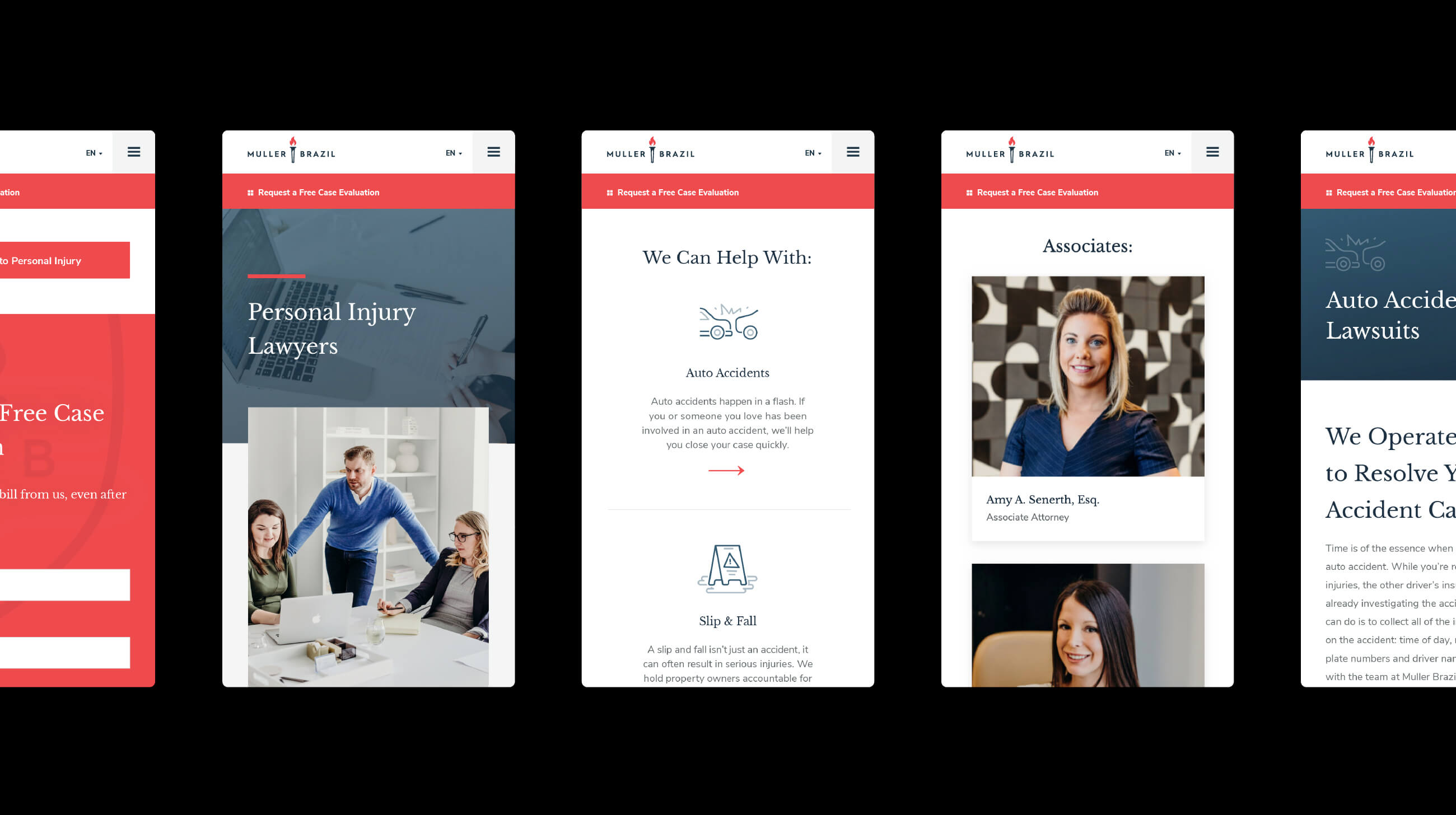
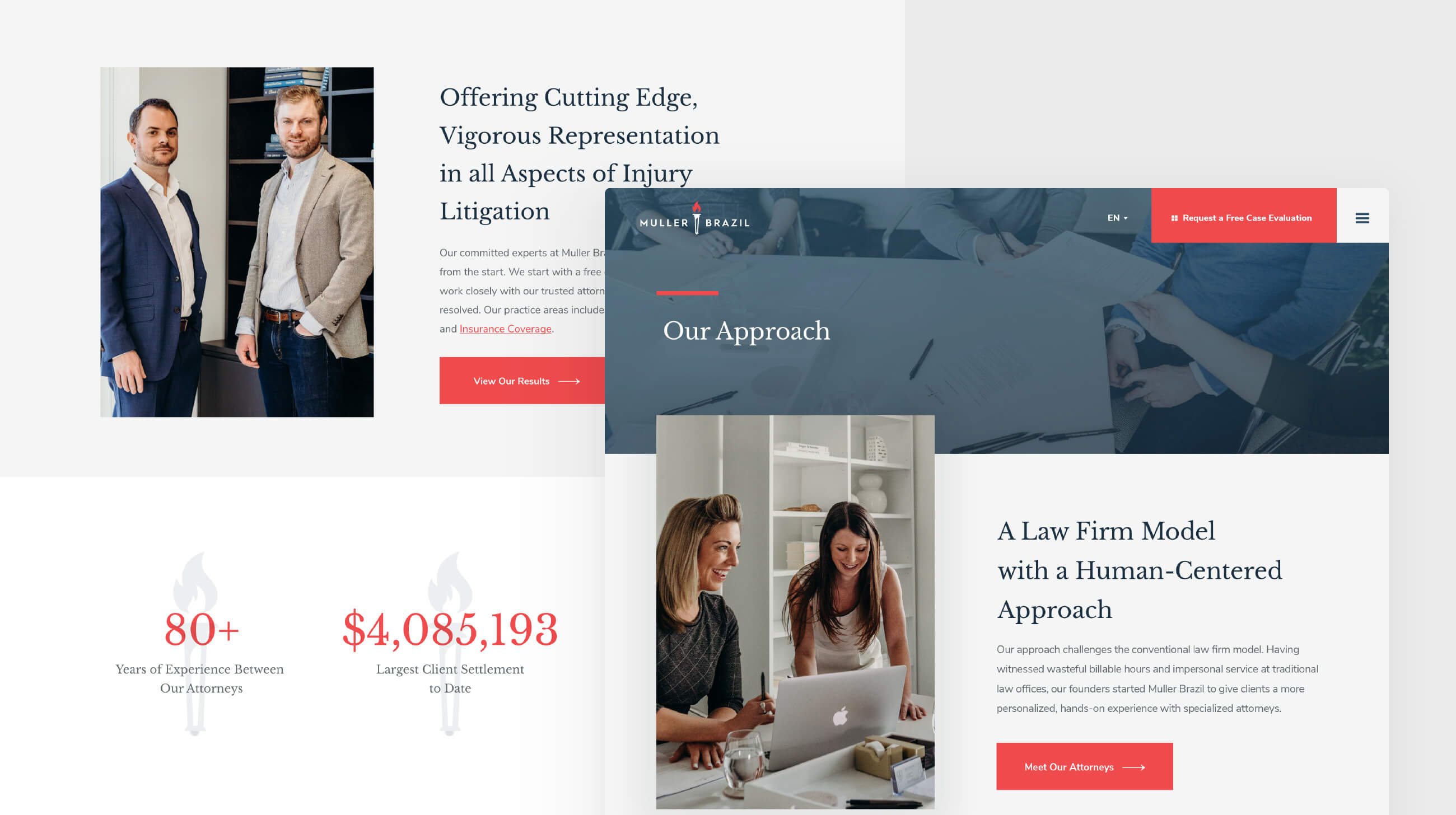
Serving as the brand’s focal point, the torch logo was designed to represent a guiding light shining during difficult times. The color palette was strategically chosen for its fresh and modern feel while still reflecting the firm’s professionalism.
Rather than build a static design unable to meet changing needs, Muller Brazil’s new brand elements were strategically developed to be dynamic. Creating a library of elements — such as a logo with and without the tag line and a logo mark with just the torch icon, for example — ensures the proper logo mark can be used appropriately.
Along with differentiating Muller Brazil from the company’s sister brand, Mole Street was tasked with creating a fresh and sophisticated brand to disrupt a highly-competitive space. To accomplish these objectives, Mole Street refreshed the firm’s branding in the following ways:
- Updated color scheme
- New typeface
- Updated brand guidelines
- Differentiated design for sister brand


