We get asked this question all the time —“When is the right time to redesign a website?”
There are times when it makes sense to make iterative changes to your current website to suit your company’s growing needs. There are also times when it is best to start fresh with a brand-new design and build. How can you tell the difference? Read on to find out.
6 Signs It's Time to Redesign Your Website

Sign #1. It Looks/Sounds Out of Date
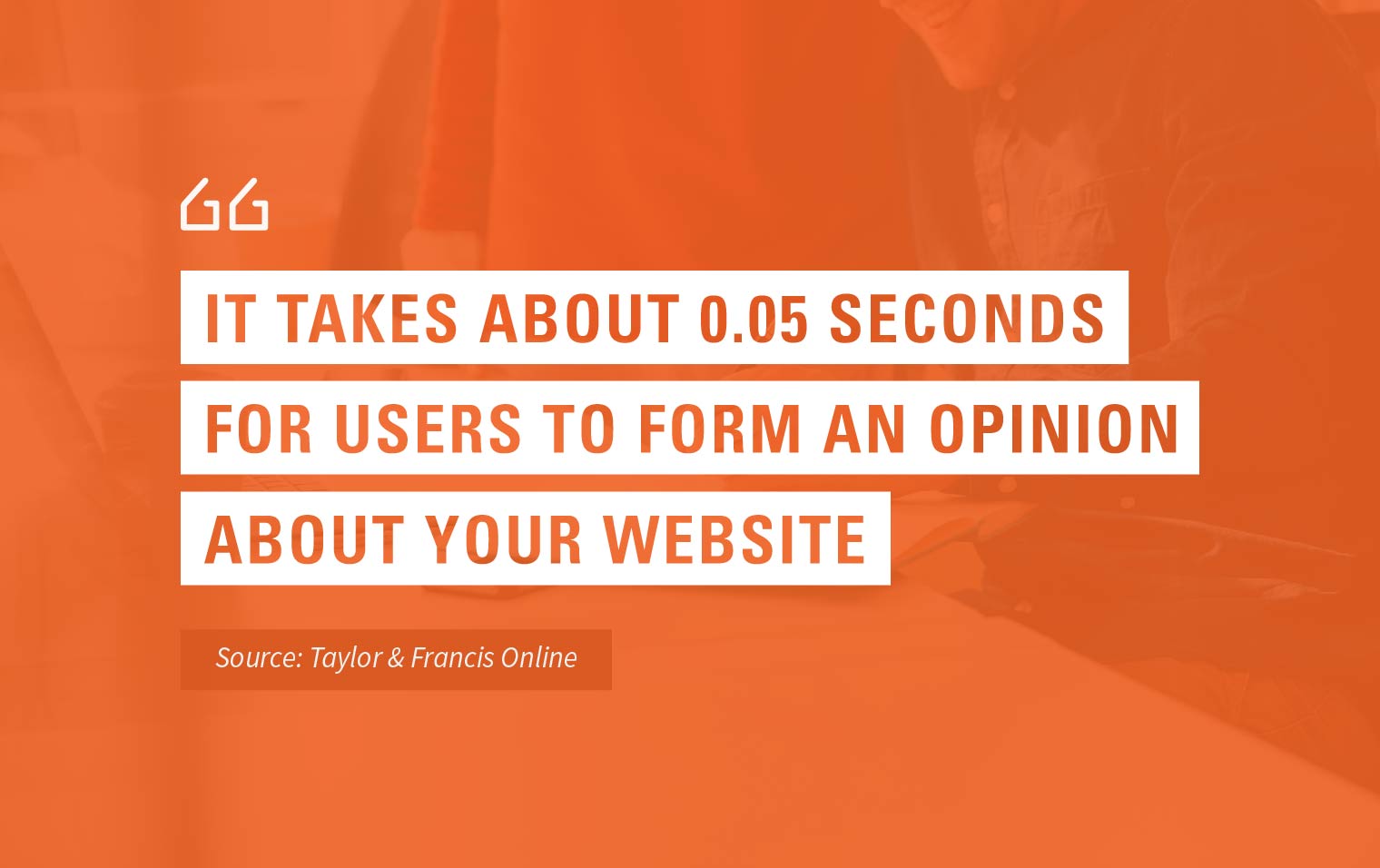
You’ve probably realized by now that your website has an effect on the way consumers judge the credibility and quality of your business. According to the findings of three academic studies, it takes about 0.05 seconds for a user to form an opinion about your website — and that opinion either keeps the user curious about your website or makes them leave immediately.
If the design of your website is outdated, visitors to your website your business. The best way to fix this problem is to redesign your site, pronto.

Does your website copy miss the mark when it comes to speaking about your products and services? Is the content on your homepage boring or stale? Do people have a hard time understanding what exactly it is that your business does, even after reading your "About Us" page? If you answered yes to any of these questions, then it’s definitely time to reevaluate your messaging and redesign your website.
As much as the visual design influences the way your credibility is perceived, the execution of your messaging (a.k.a. the "sound" of your website) does, too.
According to Sweor, users spend 5.59 seconds looking at the written content of a website. That’s not a lot of time for readers to actually digest your text, so you need to keep your written content direct and snackable so users can quickly and easily consume the information.

Sign #2. It Isn't Mobile Responsive
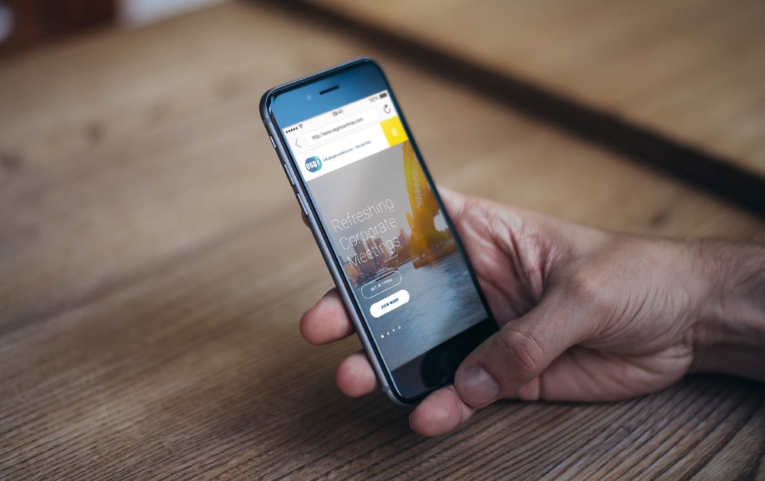
As gorgeous as your website might look on a desktop, if it doesn't respond to (or render well on) mobile devices, you're losing out on potential sales. According to Statista, 58.99% percent of web traffic worldwide in Q2 2022 was driven through mobile devices — and that number only continues to grow.
Responsive design does not just mean formatting your website so that it fits within the screen of a mobile device. Responsive web design and development take into account the entire user experience as well as screen size, platform, and orientation. This primarily consists of configuring:
- Viewports and breakpoints
- Flexible grids and layouts
- Text and images to scale
- CSS media queries
(More about user experience later...)
Sign #3. Visitors Are Struggling to Navigate
This point cannot be emphasized enough: if your website's visitors cannot quickly and easily find what they need, they will leave. The ultimate goal of any business' website is to convert visitors into customers. A site cannot achieve that goal without clear navigation.
There are two concepts to keep in mind when reviewing your navigation — findability and discoverability. Findability is the ease with which visitors can locate a feature or piece of content that they believe to be available on your website. Discoverability is the ease with which visitors can notice or uncover information on their own.
So how do you know if your navigation needs a refresh? Look at your engagement and bounce rates. If your engagement rates are declining and your bounce rates are rising, there's your sign. To figure out exactly where users are struggling to navigate, use a heatmap tool to monitor user behavior and identify pitfalls in your site’s navigation (or leave the heatmapping to the growth-driven design experts).

Sign #4. Updating the Content Is a Pain
If you have to engage with a web developer every time you need to update the content on your website, it’s time for a redesign. Your website's content management system (CMS) should have a user-friendly interface so that you and your team can easily make edits. If it doesn't, consider migrating your website to HubSpot.
Related Read - B2B Case Study: HubSpot CMS Website for Fruit Importer
Sign #5. Conversions Are Subpar
If your business isn’t gaining new leads and customers via your website, it’s time to invest in a redesign. You want your website to be inviting and engaging enough that visitors want to stick around. However, the ultimate goal is to convert those visitors into customers.
For lead capture, having a single form on your website's "Contact Us" page just isn’t enough. Users today expect options like a live chat, chatbot, or online knowledge center. They're also willing to give you their email addresses in exchange for helpful tools, templates, and other high-value content marketing assets like eBooks and whitepapers.
Sign #6. It's Nowhere Near the First Page of Google
You might be surprised to learn that your site's organic keyword rankings on Google are lacking despite your best optimization efforts. Recent updates to the Google Search algorithm have made user experience more important than ever before.

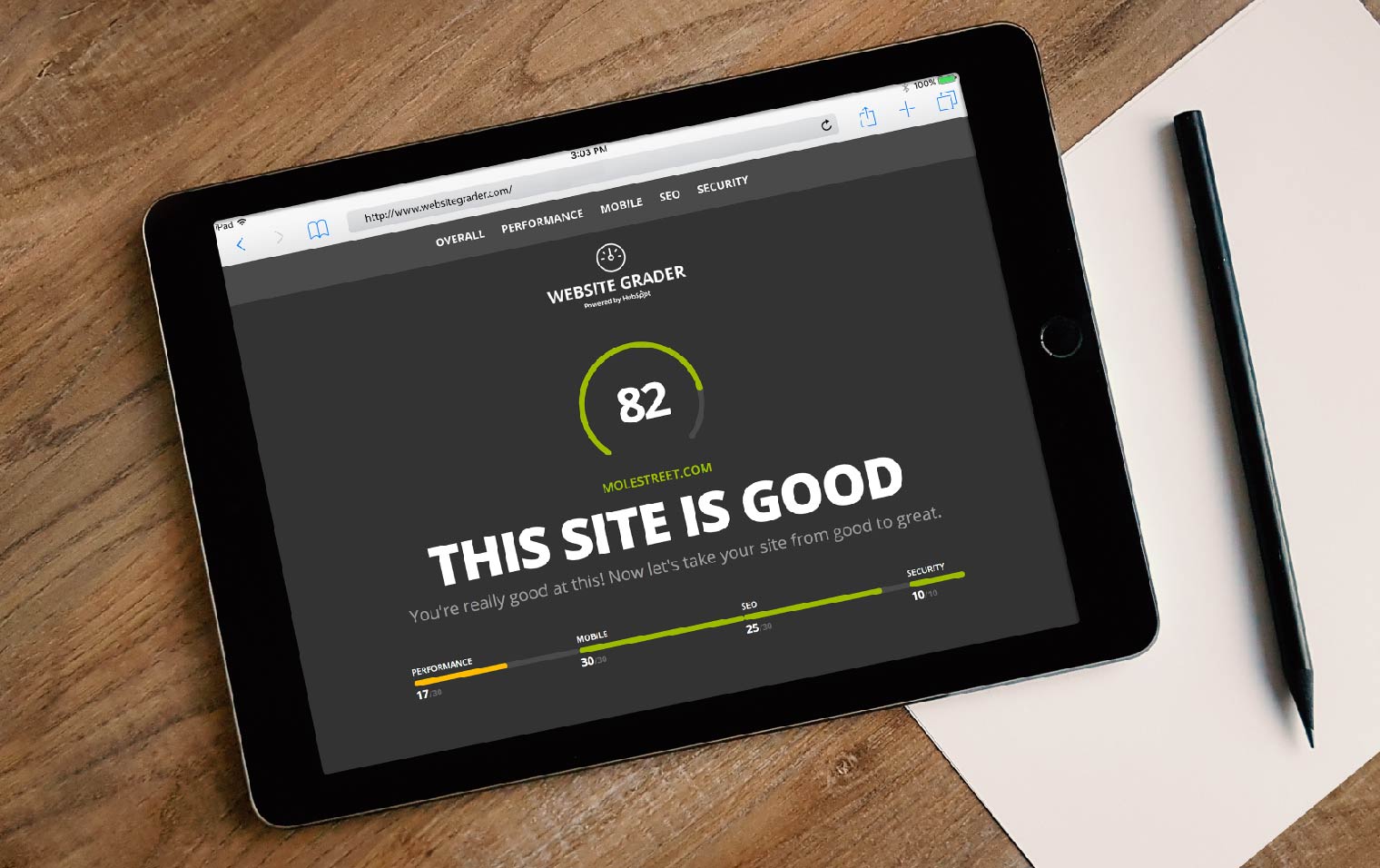
How well is your website performing in terms of user experience? Google Search Console is a good place to find out. Use it to review your site's Core Web Vitals — Google's self-proclaimed "set of real-world, user-centered metrics that quantify key aspects of the user experience.” HubSpot’s Website Grader Tool can also provide helpful insights into a site’s organic search strengths and weaknesses.
In Conclusion
If you read through this list of signs only to realize that the time is now for a website redesign, Mole Street is here to help. Get in touch with us today to explore our HubSpot growth-driven design services. It's never too soon to redesign your website to work for (vs. against) your business.
Originally published January 2020. Updated September 2022.


